Home > Practice > Data Interpretation > Bar Graphs > Miscellaneous
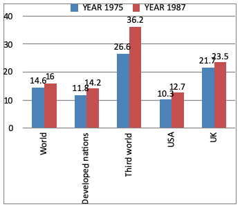
1. Study the following bar graph and answer the questions. The Bar graph gives the annual rates of inflation in percentage for 1975 and 1987.

Comparing the figures for USA vis-a-vis the developed nations, it can be concluded that.

Comparing the figures for USA vis-a-vis the developed nations, it can be concluded that.
Solution:
From graph it is clear that USA had better central on inflation.