Home > Practice > Data Interpretation > Bar Graphs > Miscellaneous
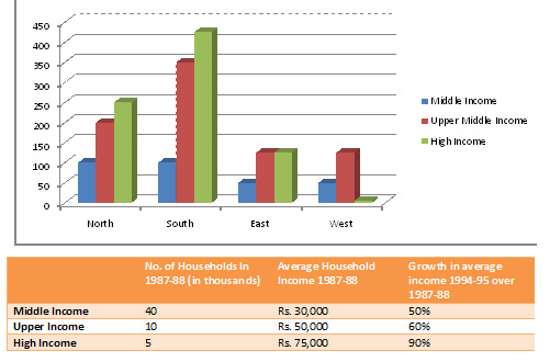
1. The following bar chart gives the growth percentage in the number of households in middle, upper-middle and high-income categories in the four regions for the period between 1987-88 and 1994-95.

Which region showed the highest growth in number of households in all the income categories for the period ?

Which region showed the highest growth in number of households in all the income categories for the period ?
Solution:
From graph it is clear that southern region showed the highest growth in number of households in all the income categories for the period.